Awhina Health Care
Awhina Health Care
")
Awhina Health Care Website & Branding
Creating a Caring Online Presence
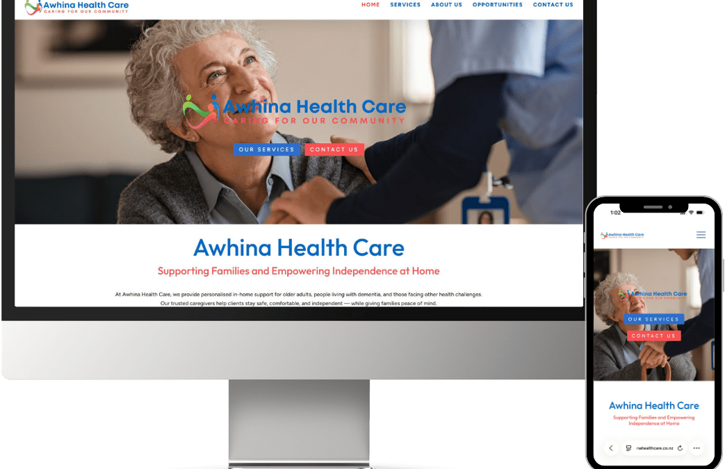
When Awhina Health Care approached us, their goal was to establish a professional, welcoming online presence that reflects their commitment to quality healthcare services. Beyond just a website, they wanted a cohesive brand identity, including a logo and colours that convey trust, care, and compassion. We worked closely with the Awhina team to deliver a modern, user-friendly website, a complete branding package, and print materials that truly represent their mission and values.

Building a Brand That Inspires Trust
Healthcare is personal, and Awhina Health Care wanted their brand to reflect warmth, professionalism, and reliability. Our first step was creating a logo that communicates care and support, paired with a colour palette that feels approachable yet professional.
The result is a visual identity that instills confidence in patients, while still feeling friendly and accessible. Soft, calming tones were combined with clean, modern typography to create a cohesive look across all touchpoints, from the website to printed materials.
Print Materials That Reinforce the Brand
In addition to the website and digital branding, we designed a range of print products for Awhina Health Care, including flyers, business cards, and display folders. These items carry the same professional, approachable design as their website, ensuring a consistent brand experience across all touchpoints.
Whether handing out flyers in the community, presenting information in a display folder, or sharing contact details on a business card, each print product reinforces Awhina Health Care’s trustworthy and caring image.
A Website Designed for Patients
The Awhina Health Care website focuses on clarity, ease of use, and accessibility. We designed a site that allows visitors to quickly find the information they need, from services offered to contact details and booking options.
Key features include:
-
Clear service pages that outline the care available, including assessments, treatments, and support programs.
-
User-friendly navigation that makes it easy for patients to find the right service or health professional.
-
Mobile-first design to ensure a seamless experience on smartphones and tablets.
The website’s layout and colours reinforce the brand identity we created, while imagery and icons convey a sense of care, trust, and community.


A Digital Presence That Reflects Awhina’s Values
We are proud to have delivered a full branding package, modern website, and high-quality print materials that align with Awhina Health Care’s values. The new site provides patients with a clear, welcoming introduction to the services on offer, while the logo, colours, and print products create a professional, cohesive image across all channels.
With this new online and offline presence, Awhina Health Care can effectively connect with patients, showcase their services, and build trust in the community they serve.